7.30.2010

Film // Visual Acoustics: The Modernism of Julius Shulman


Visual Acoustics tells the story of California Modernism through the eyes and camera of Julius Shulman (1910-2009), a man whose humility, kind temperament and infectious humor belie his standing as the preeminent American architectural photographer of the past century. His lens was the conduit through which many of this country’s most famous and brilliant designers became publicly known; Richard Neutra, Rudolf Schindler, Frank Lloyd Wright, Albert Frey and John Lautner all owe some measure of their professional success to the elegant way Shulman represented their work. His role as the anonymous herald of American Modernism, helping to foster an appreciation for the movement both domestically and abroad, is a fascinating subject for this whimsical but streamlined documentary from director Eric Bricker.

Historically, Julius Shulman’s opera completa successfully captures the essence of the pioneer spirit that drove disciples of Wright and Louis Sullivan from the Chicago area (Lautner, E. Stewart Williams) and students of the Bauhaus (Neutra, Schindler) from central Europe to Los Angeles in the early 1930s. At that time, Los Angeles was experiencing an unprecedented building boom, having grown from the 36th largest city in the US in 1900 to the 5th by 1930. Sprawling urban conditions and an unrefined surrounding natural landscape provided designers with an irresistibly clean slate on which they could test new designs and construction techniques. Los Angeles became a locus of creative expression. Much of the work that followed in the region featured a trademark exuberance that came to represent a new California-based architectural vernacular. Shulman translated this language into images; his most iconic, a night scene of Pierre Koenig’s Case Study House #22, combines the grace of modern architecture, the vitality of west coast living and the hopeful glow of progress exuded by the evolving American city into one frame. The house itself, now regarded as a masterpiece of domestic construction, became, as a result of Shulman’s photography, a symbolic representation of the goals of an entire age of architects and designers.


From a visual standpoint, the film seems to direct itself; Shulman has already provided the story in his photographs. What differentiates this film from other architectural documentaries, however, is its focus on the means by which public perception and interest in architecture is generated rather than the individual architect or building. The ideal experience of architecture, of course, occurs in situ, where in the presence of context we are able to understand the nuances of space and detail; unfortunately, by circumstances of economy, logistics, or geography, the opportunity for such an experience is as rare as the buildings we deem worthy of our attention. We rely accordingly on the literate, sensible eye of the traveling professional photographer to translate these characteristics and convey them in single images. Through his own interpretations, the photographer controls our response to the subject matter. Shulman—a staunch environmentalist and outspoken critic of Postmodern reactionaries—did so with his work.

Shulman was in the unique position by virtue of his craft of having some involvement with nearly every great work of American Modernism. While architects are isolated practitioners who devote themselves for years to one project in one place, Shulman with his many clients functioned as the sociocultural link between architects, developers, and tenants scattered across the country. He knew everyone and seemed to share a common language even when architects disagreed amongst themselves. He developed long-lasting personal friendships—particularly with Neutra, his early mentor, Schindler and Lautner—that transcended professional practice or esotericism. His life binds the entire history of American Modernism and the lives of the people involved into one neat package, providing the perfect human perspective for a film on the subject.

Lately I’ve had the good fortune of seeing two very disparate yet inspiring films rooted in architecture; first, Inception, which appeals to my as-yet-undeveloped creative futurist side, and this film, which reinforces my modernist romanticism. Each has strengthened the thrust of the pioneer spirit that is fueling my west coast odyssey. In short, I can’t wait to go! Sandy beaches, palm trees and Cali style here I come…

Notes

-During the few minutes of the film devoted to Shulman’s criticism of Postmodernism, two buildings in Atlanta (photographed by Shulman, naturally) were shown as examples of architecture he disliked…Can anyone guess what they are? Bonus points or other miscellaneous favors for the winner. You can find both of the buildings in my Flickr album….;)

-If you want to see originals prints of Shulman’s photographs, they are currently on display on at the Getty Center in Santa Monica, CA.

-Arts & Architecture Magazine was the venue where many of Shulman’s photos were first published, especially those featuring the Case Study Houses. This magazine was instrumental in spreading the work of Shulman and the architects he photographed, but its importance constitutes a whole set of posts on its own…so I’ll get to it later haha

7.27.2010

Icons of Modernism // Lustron

I didn't know anything about the Lustron Corporation until I came across a featurette in the AJC about an Atlanta woman who owns and has installed some period decor in one of their 1940's pre-fab houses. From my own limited knowledge about the history of the type, this must have been one of the first mass-produced pre-fabricated homes in American history, manufactured from spare metal leftover from the war effort. The houses are very modern but modest, well-designed and easily disassembled and moved. The Wiki article above lists some of the various model configurations from which consumers had to choose, and goes into a bit of detail about the downfall of the company in the early 1950s, which occurred even during a period of great demand for affordable and efficient housing. Below is an image of the refurbished model in Atlanta; bottom is an audio clip from MOMA about the inventor of the Lustron, Carl Strandlund.

Project // Southern Polytechnic State University

This is an exciting time for me, as I'm not only anticipating my impending move to Los Angeles, but also wrapping up my first realized self-directed design project at Southern Polytechnic State University in Marietta, GA. I have been involved in the interior design and provided all of the relevant interior architectural services for two dormitory buildings and a dining hall. Currently, we are in the process of installing furniture. The furnishings reflect the over-arching mid-century modernist theme, which is inspired by the architecture of the Marietta campus's 1961 core. The theme does not necessarily imply a referential design approach, but instead subtly guides proportion, directionality of surface, material choices, graphic patterns and artwork.

7.24.2010

Building // Wal-Mart's Green Roof

This short demonstration explains the details behind the world's largest monitored green roof, which was recently installed on a Wal-Mart in Chicago. We have so much unused roof space in this country--I hope this project encourages more like it.

7.23.2010

Building // US Pavilion, Shanghai Expo 2010

The commercialization of "national" architecture in the United States has led to a consistent decline in the quality and innovation of American exhibitions on the world stage...true to form, the US Pavilion at the Shanghai Expo is another poor showing. Bland, cliche, and worst of all, designed by a Canadian firm ;) Go ahead and check out some of the other entries and be amazed.

From an article in Architecture Magazine by Fred A. Bernstein:

[The U.S. pavilion, which looks like a suburban auto dealership, is just one step up from the prefabs. The pavilion is the result of a 1999 law that makes it hard for the U.S. government to spend money on international expos, a short-sighted bit of isolationism that has led to a series of embarrassments. A nonprofit corporation struggled to raise money to build it, and—with funding unsure until the 11th hour—commissioned a no-frills building by the Canadian architect Clive Grout, whose firm specializes in pavilion and “attraction” design. The building Grout produced isn’t the complete humiliation some predicted: It has a graceful shape and a high-tech sheen. But it’s hardly a beacon of U.S. ingenuity.] Ouch.


Photo: ArtInfo / Ian Zhang

For those of you that live in Atlanta, this may remind you of a few buildings...liiiiiiiike this:

7.21.2010

Intro // A Particular Brand of Building

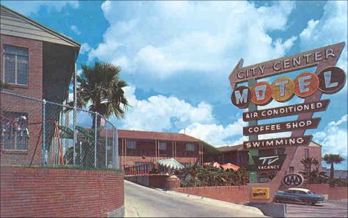
Here I intend to showcase the best and most interesting American commercial architecture with particular emphasis on corporate retail. In many ways this series of posts will be an ode to Venturian postmodern ideologies, but many companies are eschewing the “decorated shed” for a more integrated, design-oriented approach to edificial marketing that constitutes a more thoughtful response to urban conditions than the traditional American strip-mall, fast-food restaurant, etc. The posts about urban spas and garage reuse can be thought of as precursors to this topic.


^^^Target, Atlantic Station, Atlanta, GA. The actual Target logo is tiny, but the architecture is successful in conveying the brand image. Below, some Green features - plantings, trees, outdoor furniture, permeable surfaces.


The iconography of American commerce in a historical sense is tied to our automotive culture. Rather than acting as agents of restraint, bureaucrats, city planners and architects yielded to, and in several instances created, the changes in lifestyle brought about by the car’s popularity. The Federal-Aid Highway Act of 1956 established the interstate highway system, replacing the train as the primary means of long-distance ground transportation and connecting major cities to satellite towns called suburbs, which became the new standard of American urbanism. With the expansion of infrastructure, the Modern movement, which had taken hold in Europe decades earlier, began to flourish in American art and architecture.

Circumstance, meanwhile, forced businesses to adapt to these changes. Centers of American commerce shifted from town squares to mega-malls. Brand imagery became increasingly important as companies sought new ways of attracting transient suburban customers. Billboards, marquees, and other forms of signage, whose exaggerated scale and aggressive graphics were necessary persuasive devices, came to represent the physical division between businesses and the fast-moving traveling consumer. Cities that embraced the shift, like Las Vegas, a mere rail stopover before the construction of nearby Hoover Dam in 1935, seemed to emerge overnight and attract immediate attention.

7.18.2010

Discussion // World Architecture Survey

Vanity Fair just published a survey of 52 highly-acclaimed architects (some of whom are my own favorites), authors, and academicians, to determine the 5 most influential works of architecture of the past 30 years. The overwhelming winner, according to the story, was Frank Gehry's Guggenheim Museum - Bilbao. American buildings named in survey responses include the Cooper Union building by Morphosis and the Seattle Public Library, Central by Rem Koolhaas.

See the article here.

Listen to the NPR interview with the story's editor here.

And who was the only architect to pick his own work as the most influential? Wolf Prix of Coop Himmelblau....figures. ;)

Lifestyle // Where I Lived, and What I Lived For


Title of this post refers to a chapter of Thoreau's Walden Pond that describes what man can learn from a simpler existence tied to a more direct connection with nature. Is this the next modern home - or is it anti-modern? Can we make cities and communities of this type of home? Will these communities be mobile? 

[Thanks to Vasu Abhiraman for the link.]

7.17.2010

Lifestyle // Modern American Parenting Techniques


Sigh.

"Sounds like...brainwashing to me!" - Dr. McCoy

Film // Inception


Even without prolonged consideration, I can say with certainty that Inception is truly one of the most remarkable films ever made. If you are an architect and are passionate about your craft, the philosophical questions posed in the film about the nature of creativity should resonate to the very core of what drives you. I mentioned in a comment on the previous post, which is also about architecture in film and whose content bears relevance to this post, that I have recently been interested in only the visceral qualities of buildings - material, texture, shape, form, aesthetic - but I'm finding that view to be incredibly short-sighted in light of the words of respected colleagues and the works of genius artist/philosophers like Christopher Nolan. I have learned that dreaming, sensuality, and the creative subconscious are all just as important as we interpret our world through our mind. 

I don't want to discuss particular points of the movie here, but I am really curious to hear insight from the rest of you. For myself, I can already tell grad school will be a rewarding venture - I can't wait to put some of these notions to the test!

7.16.2010

Discussion // Sensual Envy

Check out this funky video of the new Rolex Leaning Center, Lausanne, Switzerland, by Japanese firm SANAA (thanks to Brian Ward for the link...)

7.15.2010

Idea // American Bathhouse

^^^The new American Bathhouse?

In ancient cultures blessed with geothermal springs and other natural heat sources, the bathhouse was as ubiquitous as any other structure within the city. Greeks and Romans founded many of the practices we now associate with modern western spas in buildings called balneums and thermae, which, as time progressed, became centers for relaxation and socialization. These were also some of the first attempts in the Western world to create public facilities, open to both men and women, for the practice of personal hygiene.

7.11.2010

Icons of Modernism // Atlanta-Fulton Public Library, Central Branch

Atlanta-Fulton Public Library, Central Branch
Location: Atlanta, GA [map]
Architect: Marcel Breuer
Year Built: 1980
Related Works: Whitney Museum, NY

 Amazingly, this work by Breuer - one of the last of his lifetime, as he died one year after the building's completion - remains largely anonymous even though its origins in the International Style distinguish it from almost any work in the Southeast outside of Florida. The building is wonderfully integrated into the complicated and often disjointed block layouts of downtown, and is yet another showcase of Breuer's lifelong affinity for cast-in-place concrete as a material that plays the dual role of dictating both structure and form. From a philosophical standpoint, the work reflects Breuer's pragmatic attitudes towards civic buildings (especially those that house books and art) in dense urban areas.

We in Atlanta are privileged to have a building of this quality in our architectural heritage, yet our government's unforunate and rather pathetic disengagement from the art & design community - Georgia, for example, almost became the first state to disband its Arts Council - has once again placed a modern masterpiece in jeopardy of demolition. Thankfully, with the help of generous donors and grassroots support, the building stands and remains as it should - a testament to the talents of one of America's truly great architects.

7.09.2010

Theory // Continental Divide

A conversation (page 22) between USC professor Andrew Liang and visiting adjunct Sarah Graham, principal of agps architecture, highlighting the differences in architectural philosophy and practice between Europe and the US. She makes some very telling observations about attitudes regarding form-making and materiality, consequences of budget and infrastructure constraints, the nature of architectural education in America, and the possible impact of computer-generated design.


Childrens Museum of LA, agps architecture. Photo: copyright © by agps architecture 2010 all rights reserved.

7.08.2010

Idea // Off the Scrapheap

The Atlanta design community has been giving old auto garages the treatment recently, particularly in Decatur and other neighborhoods that aim to be more pedestrian-friendly.


Top Left: Menefee+Winer Office, Atlanta (Menefee+Winer Architects)
Top Right: Taqueria del Sol, Decatur (Unknown)
Bottom Left: Leon's Full Service, Decatur (Unknown)
Bottom Right: Fellini's Pizza, Avondale (Unknown)

Garages accommodate rewarding adaptive reuse projects for several reasons: first, their programmatic configuration is versatile and interchangable; second, they tend to be in areas with heavy traffic, pedestrian or otherwise; and third, they are a symbol of the early "modern" auto-centric American lifestyle that, in light of recent events, is coming more into question.

7.06.2010

Idea // Surfaces in Color - Part 3

This project is not in North America, but was in the New York Times this weekend and I thought it expounds wonderfully on the theme from the previous posts. Color can not only attract clients but brighten spirits in a poor neighborhood, and provide a way of rehabilitating buildings that residents cannot afford to rebuild.


(Photo: New York Times Magazine, June 23, 2010).

7.05.2010

Idea // Surfaces in Color - Part 2

Here are a couple of examples in Atlanta of the use of flat, painted-on graphics to convey a design intent.


Top: Silhouette Building, Midtown Atlanta. (Architect: REES Associates, Atlanta office)
Bottom: salonred kids, Decatur. (Architect: unknown)

These are two buildings of vastly different scales but both use similar, low-budget graphic techniques to draw the desired clientele; in the first case, cutting-edge businesses, and the second, parents who believe their children need chic coiffures.

Building // Decatur Fire Station No. 2


The first LEED-certified new construction (non-residential) in Decatur / Oakhurst.
Architect: LP3 Architecture (Amy Landesberg + Praxis 3)
USGBC Registration

7.02.2010

Idea // Surfaces in Color

(First in a series of little design exercises and doodles, mostly impromptu, to test ideas and to gauge reactions)

I've had my eye on a building near my office for some time - the Sobu Flats apartment complex (map). I don't know much about it other than it was originally built in the 1950's by Julian LeCraw & Co. as a retirement home and recently converted to small apartments. Interestingly, the revamp was done by Hiro Isogai, the former head of the interiors department at my current firm. The building is one of the few Mid-Century Modern multi-family housing developments that I know of in Atlanta.

I really enjoy the classic ribbon window motif and clean horizontal geometries, but the building is missing something...color. White and dark grey on the exterior comprise a very sterile palette that reminds me of a hospital (especially since the building is organized in wings, similar to Aalto's Paimio Sanatorium, but even that has colored awnings). So over lunch I sketched up some potential color schemes, one warm and one cool. Interventions like this - simple additions of color or surface embellishment - will become important tools for architects as we reinvent the practice to fit the demands of the economy and society. Tell me what you think! One of the key questions is: does the addition of color/text add or detract from the inherent character of the building? Does it turn it from a elegantly composed Modernist building devoid of color into a colorful contemporary monstrosity, or is it now a more exciting building that brings energy to stuffy old Buckhead?